Experiments: Context-Aware Signage
Some prototypes for physical warnings that only appear to the people violating them
I brainstormed ideas for warning signs that are invisible to everyone except the intended target, and built five quick prototypes.
Why?
Public spaces like train stations, parks, and roads are overflowing with warning signs and instructional posters. Most of these signs are completely irrelevant to us or state things we already know, which ultimately buries the notices we actually need to see.
In digital advertising, overexposure to irrelevant banners causes Banner Blindness (the subconscious habit of tuning out anything resembling an ad). I realized the exact same thing happens with physical signage: our brains learn to tune it all out.
If physical signs could improve their contextual relevance to individual users just like online ads do, could we (1) communicate necessary warnings far more effectively while (2) clearing visual clutter to preserve the appearance of public spaces? In other words: what if warning signs were only visible to the people who need to see them?
Thinking through this led to a bunch of ideas, so I threw together five quick physical prototypes. While many need a lot more thought before implementing in society, I hope they serve as fun thought experiments.
1. The Pedestal That Complains When Flashed
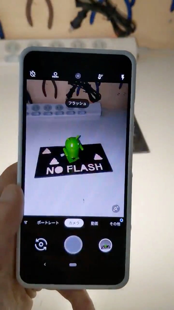
Museums and theaters often ban flash photography. While protecting exhibits and preserving ambient lighting is important, seeing ugly "NO FLASH" stickers plastered everywhere can ruin an otherwise beautiful space. I wanted a way to scold anyone who triggers a flash—knowingly or by mistake—and stop them from taking a second shot:
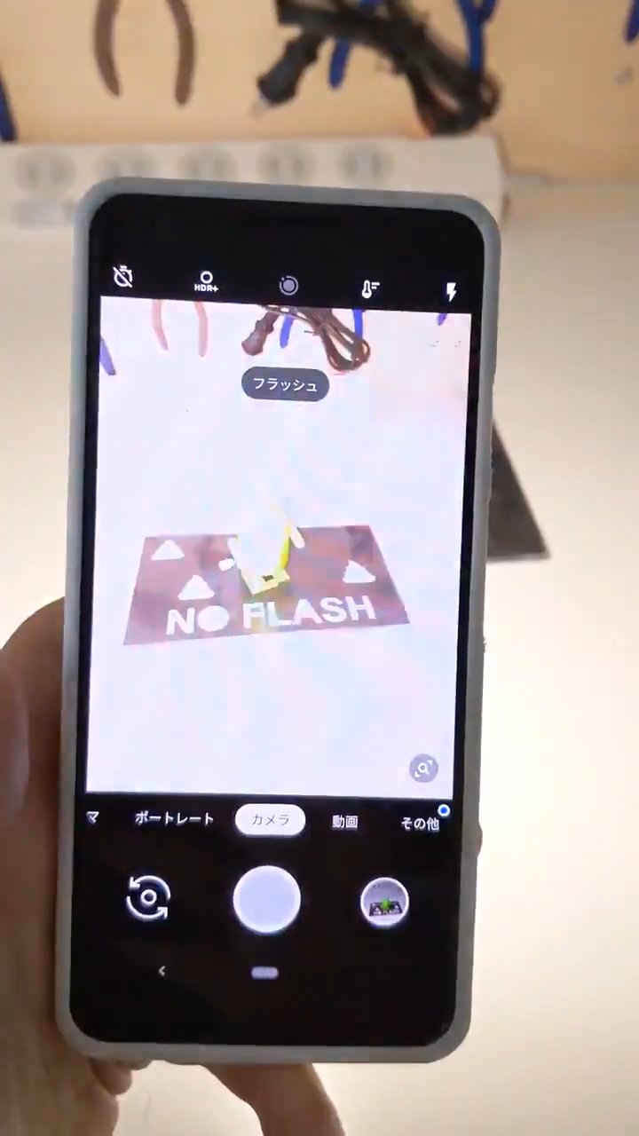
Placing a black mask with cutout letters over a black retroreflective sheet renders the text completely invisible under ambient light. (Covering it tightly with a vinyl film makes it virtually undetectable.)
When photographed with a flash, however, only the retroreflective cutouts ("NO FLASH💩") bounce the light straight back into the camera sensor.
Visitors following the rules see nothing more than a minimalist black display pedestal. Violators get directly scolded, and their would-be Instagram photo is ruined.
Because retroreflective materials bounce light exclusively back toward the source (the camera lens), the experience of everyone else in the gallery remains entirely undisturbed.
Some online comments rightly pointed out that stopping the very first flash matters too. But if someone ignores the initial museum entrance guidelines, another generic "NO FLASH" icon won't deter them anyway. A design that preserves the aesthetic experience for well-behaved visitors while delivering direct feedback to violators feels like a far more compelling direction.
2. The Sign Visible Only Without Headlights
Reversing the retroreflective mechanic creates a sign that scolds drivers who haven't switched on their headlights. Normally, you can't clutter a highway tunnel with dozens of "Turn on Headlights" reminders due to visual noise. With this design, however, the warning targets unlit cars exclusively, meaning you could line an entire tunnel with them without distracting anyone else:
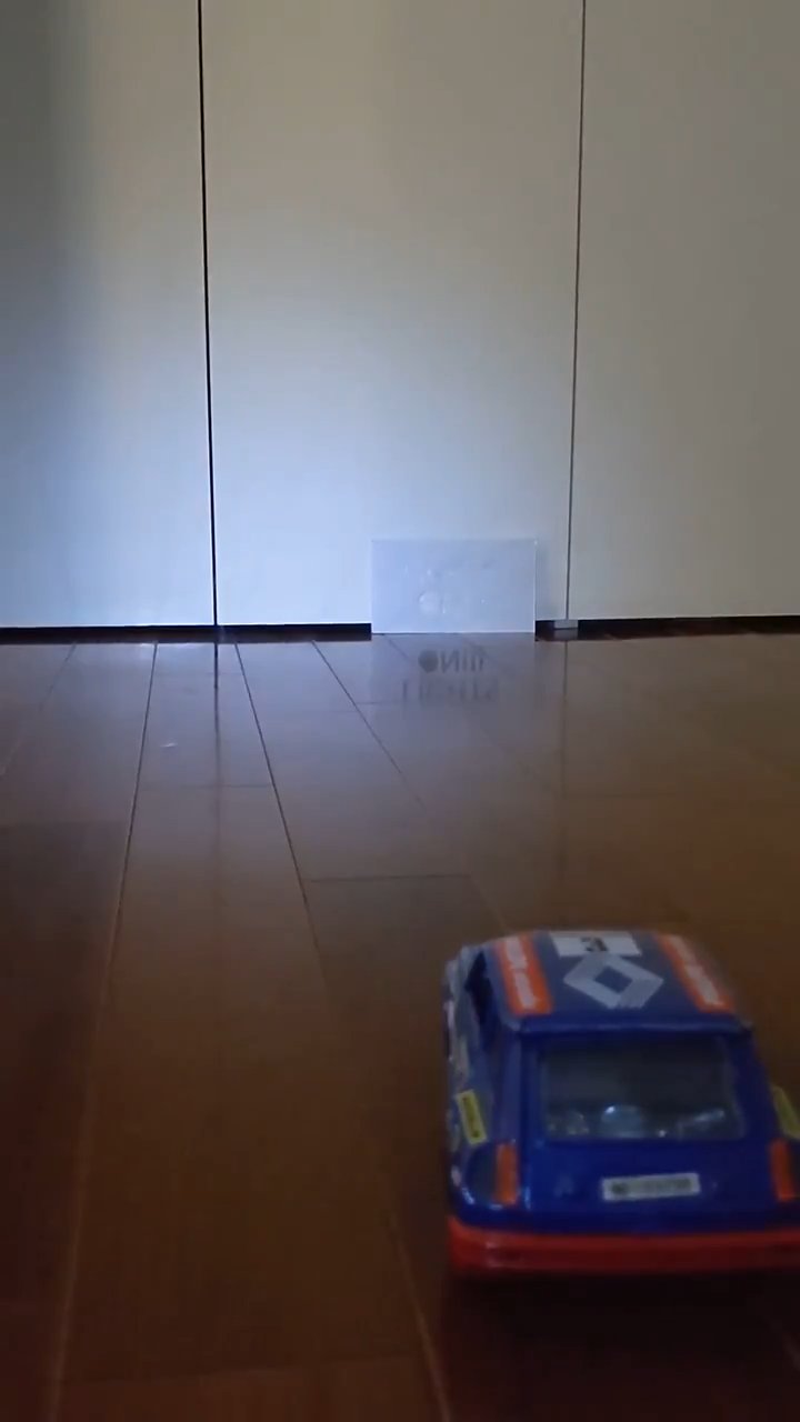
By printing white stencil text over a black retroreflective background, drivers with their headlights on wash out the entire sign in white glare, making the text unreadable. Drivers approaching with their lights off, however, can clearly read the dark text against ambient lighting.
This principle feels like it could have plenty of uses beyond just tunnels.
3. The Anti-Paparazzi T-Shirt
We've all had days at events where we'd really rather not be photographed. Default camera apps on iOS and Android automatically recognize QR codes in the viewfinder and pop up notifications on the screen. Hacking this behavior makes it possible to push custom messages—like "No photos please😘"—straight onto the screen of whoever points a camera at you:

To the naked eye, it looks like an ordinary graphic tee with a QR pattern. But the moment someone frames you in their smartphone camera, the system popup scolds them directly on their device.
While it is standard etiquette to ask before taking someone's picture, this mechanism gives you a way to issue automated, assertive feedback to unsolicited photographers. (It's admittedly useless against DSLR cameras without QR scanners, though.)
I even made it available to order here:
Pushing private text overlays exclusively to the photographer opens up other possibilities too—like providing suggested beauty filter parameters for apps like SNOW.
4. The Panicking Boarding Pass
Paper tickets remain surprisingly common on flights and regional trains. Handed a physical slip, constantly checking your watch against the departure time on the ticket can be a subtle source of stress. So I mocked this up:
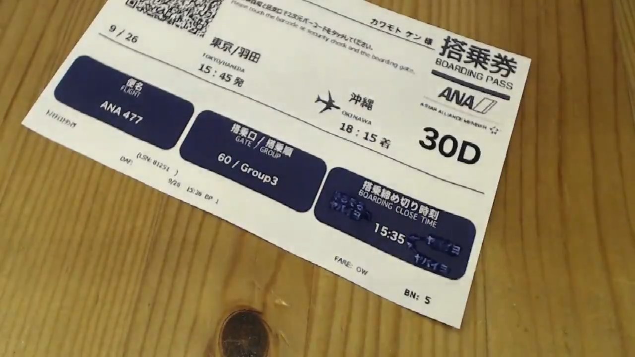
Using disappearing/time-sensitive ink, the ticket gradually changes over time to surface an urgent "Board Now!" warning as departure draws near.
In practice, the reaction speed depends heavily on ambient temperature and humidity, making precise timing tricky to control—so mission-critical boarding passes might not be the most practical deployment just yet.
Still, the concept of handing someone a physical item that reveals dynamic information over time has potential. For example, takeout food packaging could reveal a reminder to sort and recycle after enough time has elapsed to finish the meal.
5. The One-Way Hallway
Complex train stations are often a confusing jungle of directional arrows. Wouldn't it be far cleaner if you could erase every arrow irrelevant to your travel direction? That was the goal here:
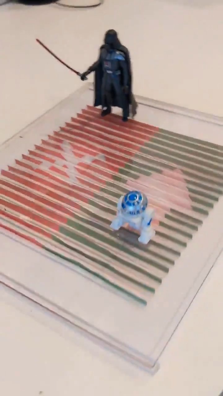
By slicing the graphic into vertical louvers across a pleated surface, viewing from one direction shows a green forward arrow, while looking from the opposite direction displays a stark red "X". This makes the correct side of the path immediately obvious to both oncoming flows, preventing collisions.
Using a lenticular lens array could expand this from two directions to multi-directional routing.
Standard floor decals can only show basic arrows or text due to the need to balance competing signage. With this directional approach, you can take bolder design choices—like turning the entire wrong side of the floor solid red—making navigation instantly readable even in packed transit hubs.
Other Ideas...
- Projecting targeted ads onto exhaled cigarette smoke clouds.
- Generating localized unpleasant audio frequencies just above/below vehicle speed limits to discourage speeding.
- Sidewalk signs that are only readable from the speed and angle of someone illegally riding a bicycle.
There are so many fun directions to take this.
Conclusion
Each of these ideas would require further engineering to survive in the wild. But there is a distinct joy in deliberately solving problems using purely passive, physical, and optical properties rather than resorting to microcontrollers or software.